The first time I visited Beamish Museum I was around 14 on a school trip, so long ago I don’t even want to think about the year.
When it first opened it was set in 1913 and is one of the best open air museums in the country. It’s a real glimpse into how life was like a hundred years ago. Since opening it has expanded into 1820 with Pockerly Manor and the 1940s Home Farm.
I’ve lost count of the number of times I’ve been since, I’ve even played my trumpet in the bandstand as part of an advert for ITV!
We now go regularly with our son and friends as your ticket lasts a year, which is great for us as we only live 10 minutes away. It’s great for a Sunday afternoon ride on the teams and the obligatory trip to the sweet shop.
Being a graphic designer I always gawp at the typography and amazing signs around the whole museum. On our last visit with friends from Manchester on their first visit, I thought it was about time I documented the posters, prints and signage. They’re fascinating as they’re a glimpse into graphic design before the invention of computers and digital printing.

Vintage advertising. 

Miners lamp storage, each miner had their own lamp number, this was so they could track easily who made it out at the end of each day and who didn’t. A harsh reality of mining.

 Religious signs played a big part in home life.

Advertising in the early 20th Century was mostly on metal plates.
 I love this vintage cupboard in the bakery. People pay a small fortune for furniture like this now.

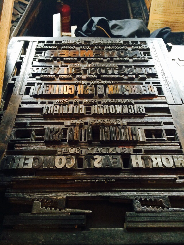
Simple letterpress posters would have taken hours to prepare.
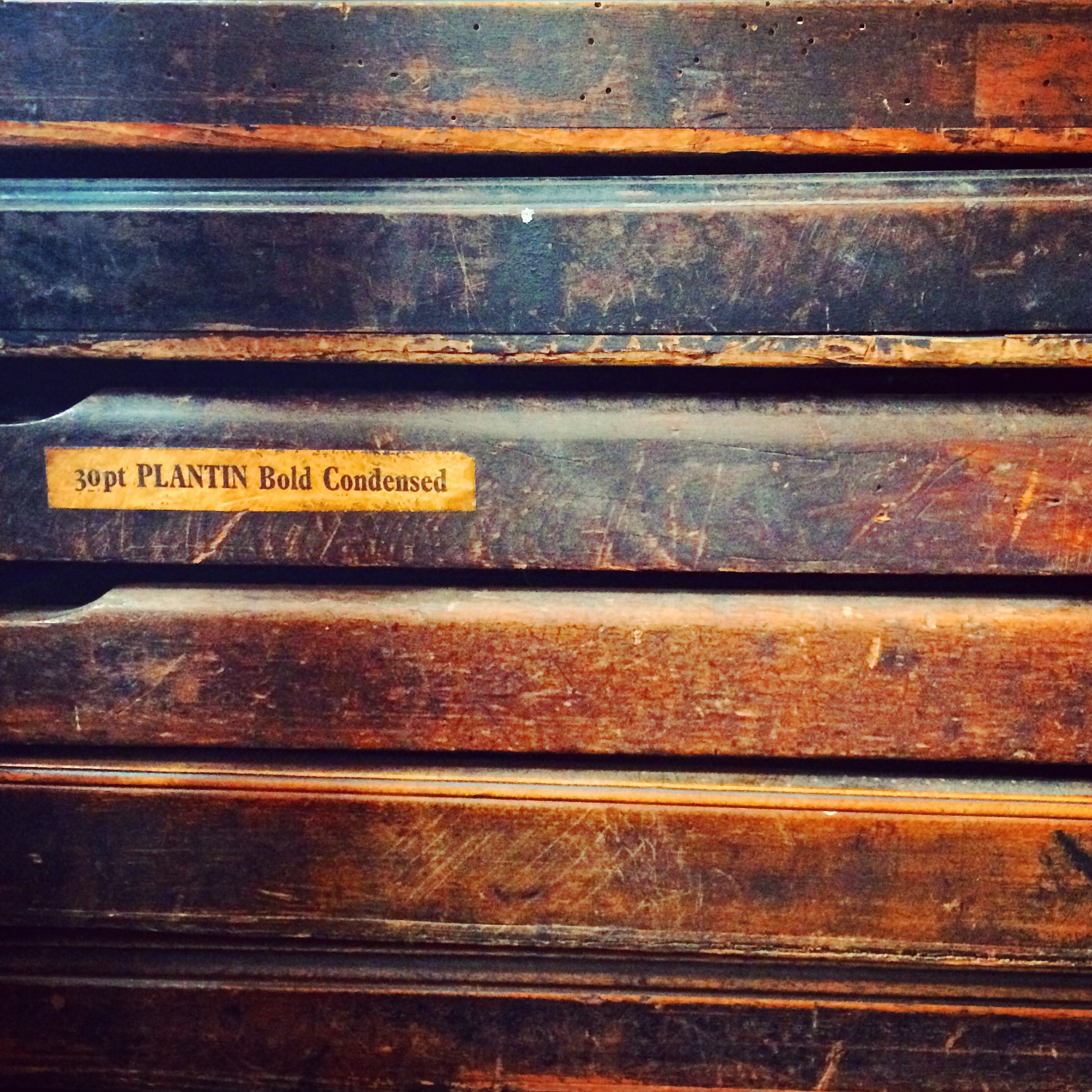 Letterpress drawers send shivers down my spine, in a good way. Just beautiful.
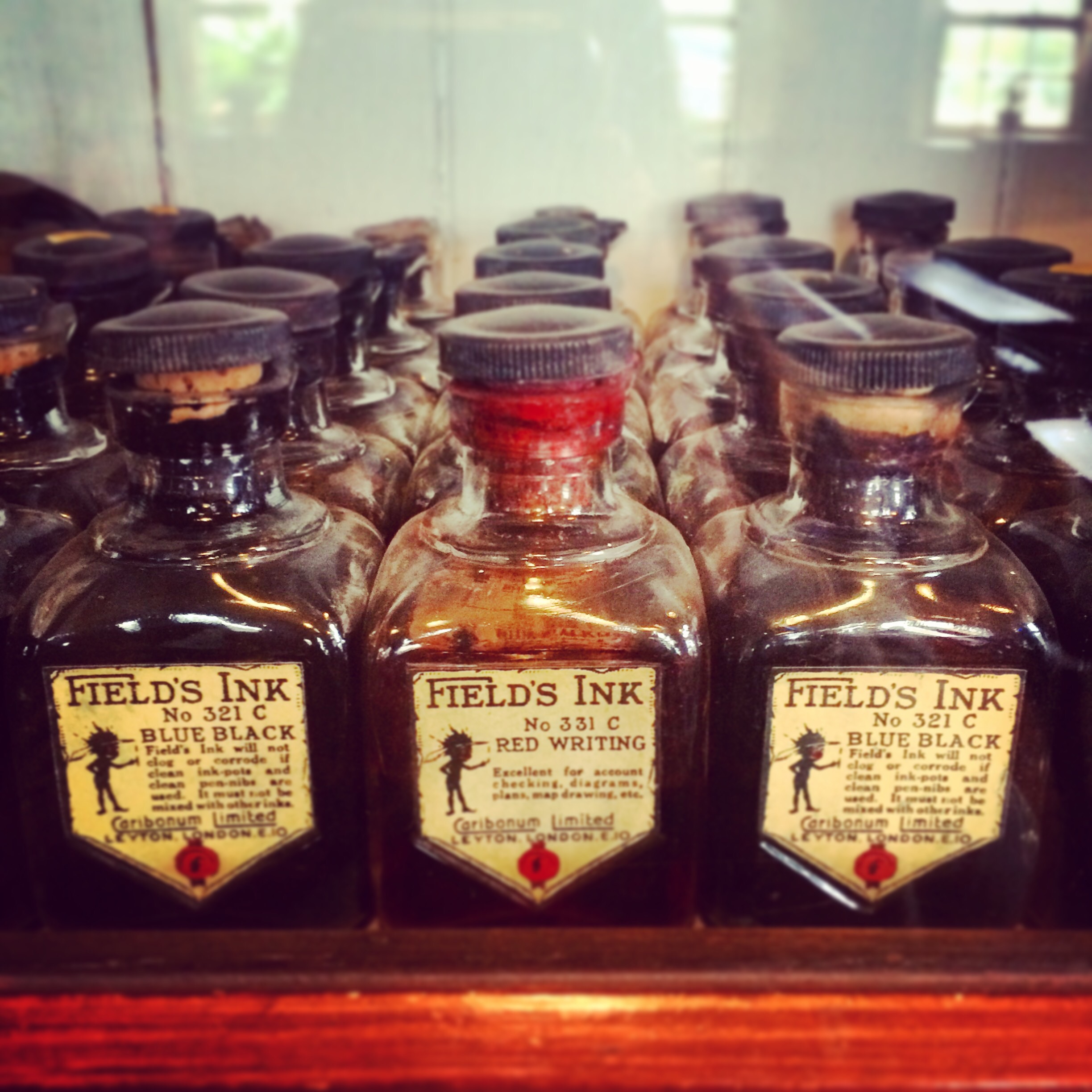
Beautiful packaging on the school ink bottles.
 People have been upcycling for a long time! Redundant advertising boards became greenhouse panels.
So next time you visit Beamish take a look at the beautiful typography. You should also take a look around you in the present day too, it’s everywhere – fonts, colours, posters, signs, magazines, packaging, TV credits, even soft furnishings.
The world would be a dull place with graphic designers and the beautiful typography we create.

I love your alternative look around Beamish – I am always too busy taking photos of the kids or big things that I don’t stop to notice the little details – I love the ink bottles.
Thanks Samantha. I’m usually the same, it’s nice to see things from a different angle sometimes isn’t it. X
Loved this. They’re the kind of photos I take there too. And there’s a photo of me in the print room where my eyes look like I’m high on something. Printer’s trays: the crack cocaine of the design world!