With two designers in our house, choosing paint colours can go on for months and involves so many changes it’s unreal. It’s not just a case of deciding on a grey scheme, or a blue scheme, we spend hours picking colours apart, it’s like the scene from goldilocks – too much red in it, too cold, a bit too green… and then finally, it’s just right!
 We’ve learnt over the years that picking colours from a paint chart can more often than not be like Russian Roulette. We choose the perfect shade of grey, get it on the walls and it looks nothing like the chart and everything like dirty dish water. After wasting so much money on paint, we realised you do get what you pay for and paints such as Farrow and Ball, Fired Earth, Earthborn and Marston & Langinger really do look exactly like their charts. They contain much greater pigments so give a much deeper finish on the walls too.
Top Tip: Tiny paint swatches don’t always give you the best idea of the finished scheme, so my little tip is to buy a paint sample, paint a strip of lining paper and hang in various points around the room to see how the colour works in different light throughout the day.
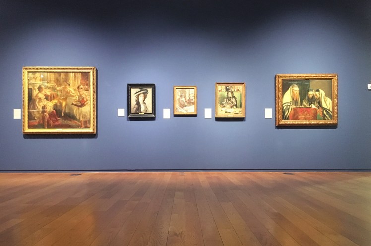
On a recent trip to the Manchester Art Gallery I discovered the Farrow & Ball collaboration in each room showing off the stunning artworks. When it comes to our own gallery walls we don’t often consider what our photographs, art and prints will look like against stronger colour, and as a whole we tend to stick to neutrals and play it safe.
The gallery walls at Manchester Art Gallery prove that we should go for it, colours make everything stronger, brighter and our homes much more inviting.
Each room has a little plaque with the colour description on so you can easily recreate at home. I’ve scoured Pinterest for the following images that you can recreate at home, take a look at my board here.


Rossetti Blue. Farrow and Ball created this bespoke paint colour, for use in the Manchester Art Gallery’s Victorian Galleries.


Drab 41. This is now an archived colour but don’t panic, it’s still available to buy.


Pelt. A deliciously deep purple that can appear almost black in some lights.


Downpipe. One of my favourite Farrow and Ball colours. A beautiful dark lead grey with a hint of blue. This works in every room, on walls and furniture.


Pavilion Grey. A lovely cool mid-grey that creates a spacious feel in any room.


Drawing Room Blue. This blue works for every room, including kitchen cabinets.
With names like Smoked Trout, Elephant’s Breath and Arsenic, they beat magnolia every day of the week!
So if your home is more beige than Mouse’s Back, you need to redecorate.
This post isn’t sponsored by Farrow and Ball, I’ve just spent years decorating my home in their paints and I’d genuinely recommend to anyone.
All room shots are sourced from pinterest, all gallery images are my own.

Really interesting Cheryl, colours look delicious! Really like the carpet on the stairs on Drab 41 too! Do you reckon its sisal?
Thanks for reading! Adding colour to your home can really change how you feel. It does look like sisal yes, try Crucial Trading for similar. http://www.crucial-trading.com
Fab post Cheryl. We love Farrow and Ball too, the colours stand out so strongly. This is a fab colab idea and it’s great to see an art gallery go for something other than an empty white space to accentuate the beauty of the paitings.
P.S downpipe is one of our favourites too, we’ve had a screen painted in the shop with that exact colour for years!
Thanks for reading and sharing! I agree, such a great collaboration. I’ve got a tin of downpipe in eggshell that is just waiting for the right piece to be painted!